How to Create a Sales Page That Converts: A Step-by-Step Guide
How to create a sales page that converts: big idea, promise, proof, offer, and checkout—built in order so paid traffic has somewhere to land.
Written by

Share this
Unlock exclusive Atomicat content
Beyond the blog (/blog), browse our free marketing resources and free tools for calculators and templates (/templates). If you came here searching for landing page tips or landing page best practices specifically, start with the pillars above before browsing further. Browse /resources and /tools.
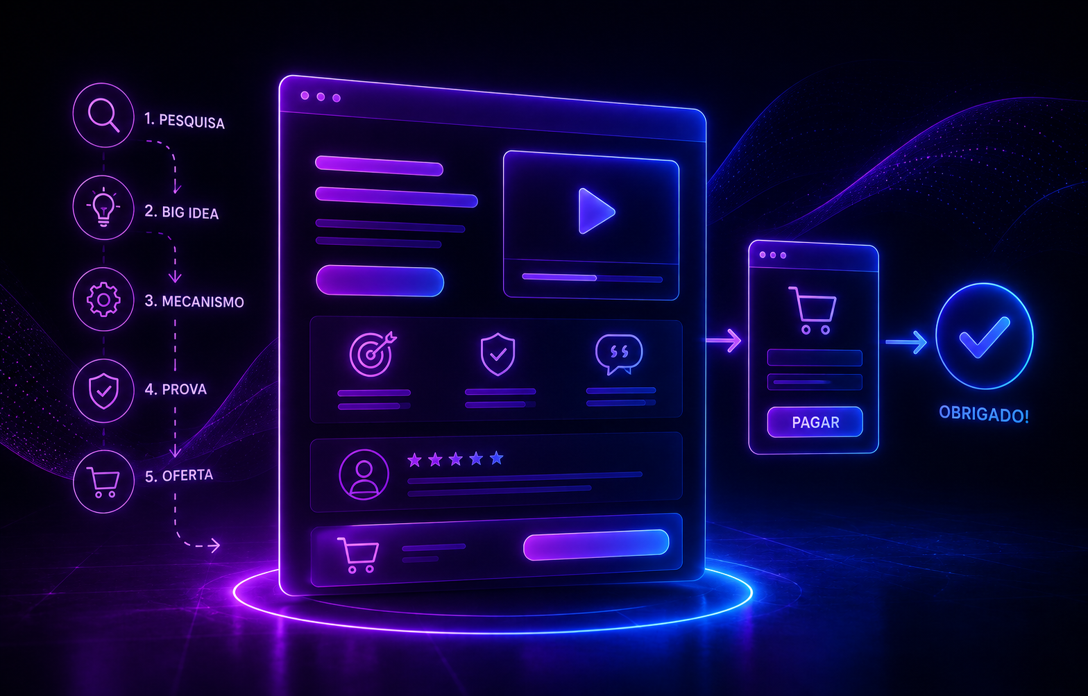
A sales page that converts does not come from a pretty template. It comes from a logical sequence of decisions: who the audience is, which pain is active, which big idea organizes the offer, which mechanism explains the result, and which proof reduces risk. Design’s job is to make that argument easy to consume.
In direct response you can use long copy, a VSL, an advertorial, or a hybrid page. The format changes, but the function stays the same: move someone from interest to decision without gaps in understanding.
1. Define the offer before the page
Write product, audience, promise, mechanism, deliverables, price, guarantee, and objections. If those answers are fuzzy, layout will not save conversion.
Also define ticket size and traffic context. A low-ticket page for cold ads can look very different from a high-ticket page fed by content and calls.
2. Turn research into copy
Use the customer’s words, not only marketing language. Support, reviews, community, and calls show how people describe the problem.
Build a swipe file of objections and real phrases. That gives more natural headlines, leads, and proof sections.
3. Organize the argument
A common structure starts with promise and mechanism, develops problem and desire, presents solution, proof, offer, guarantee, FAQ, and CTA. It is not a rigid rule, but it prevents logical jumps.
If there is a VSL, decide which part of the sale lives in the video and which part must stay visible in text. Do not hide essential information behind play.
4. Place proof next to the claim
Cases, screenshots, demos, numbers, and testimonials are more convincing when they sit next to the promise they support.
Avoid a “testimonial wall” with no context. The reader should understand why that proof matters for their decision.
5. Make checkout feel like a continuation of the page
CTA, price, payment options, guarantee, and product name need to stay coherent. A sudden change of environment or message raises doubt at the most sensitive moment.
Preserve attribution parameters so you know which creatives and campaigns generate sales, not just clicks.
6. Test the bottleneck, not taste
Use scroll, click, play rate, retention, and checkout data to decide what to test. If almost nobody reaches the price, changing button color is probably not the priority.
Test bigger hypotheses first: promise, lead, proof, offer, price, and friction.
How to take this into the operation
Turn the idea into an observable hypothesis. Define which funnel stage should move, the primary metric, and the read window. Then log which copy, creative, or page version was live. That history stops the common habit of changing five things, watching results swing, and never knowing what actually happened.
It also helps to bring copy, design, and media buying closer together. The buyer sees hooks and angles that win attention. The page team sees objections and conversion drops. When those learnings land in the same swipe file, the next creative round starts from evidence, not brainstorming alone.
Metrics that should sit next to the decision
Do not stop at CTR or conversion rate in isolation. Read clicks, page interaction, CTA, checkout starts, purchases, CPA, AOV when there are add-ons, and ROAS. On video pages, add play rate, retention, and CTA exposure. That tells you whether the change bought attention, intent, or real revenue.
Conclusion
Creating a sales page means building a measurable argument. Copy, VSL, design, and checkout need to work toward the same decision.
When the team knows which hypothesis it is testing, every page version increases learning, even when it does not win.
Frequently asked questions
What is the ideal page length?
Long enough to reduce the objections that matter. Low ticket may need less explanation; high ticket usually needs more proof and context.
Do I need a VSL?
No. A VSL is strong for offers that benefit from narrative and demonstration, but it is not required.
What should I test first?
Start with promise, offer, proof, and friction before visual micro-tweaks.
Published
August 18, 2026
Categories